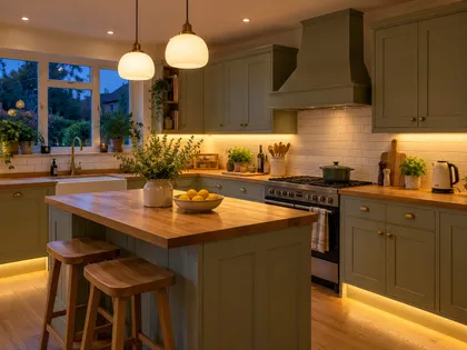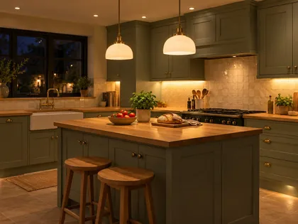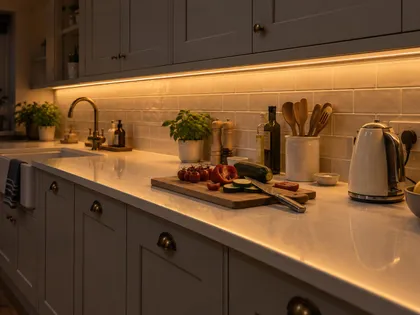
Kitchen lighting by style: modern, Scandi, Japandi and dark kitchens

Some links below are affiliate links: if you buy through them I may earn a small commission, at no extra cost to you. As an Amazon Associate I earn from qualifying purchases. How LightGuru makes money

Mike's quick answer
The layout hardly changes between styles: downlights over the worktops, strip under the wall units, pendants over the island, all on dimmers. What changes is the colour of the light and the look of the fittings. Modern kitchens suit 3000K and slim, hidden fittings; Scandi and Japandi suit 2700K to 3000K and soft shades; dark kitchens need light on the worktops, walls and floor rather than more downlights.
Most kitchen lighting advice is about layout: where the downlights go, how high the pendants hang, how bright the worktops need to be. That part barely changes from one style to the next.
What does change is the colour of the light and what the fittings look like. A white handleless kitchen, an oak Japandi kitchen and a kitchen with navy or black units can share the same wiring plan and still need quite different choices on top of it.
Below is how I’d light each one, starting with the parts that stay the same whatever the style.
The plan that works in every style
Every kitchen needs four kinds of light. General light from downlights or a track, so you can see the whole room. Task light on the worktops, which in practice means LED strip or slim fittings under the wall units, because ceiling lights alone throw your shadow onto whatever you’re chopping. Feature light from pendants or wall lights over the island, table or sink. And a low evening layer, such as plinth or shelf lighting, for when you’ve finished cooking.
Put each of those on its own switch, and the main ones on dimmers. That gives you bright light to cook by and a calm room afterwards. The full kitchen lighting guide covers the layout in detail, and kitchen downlight spacing shows where the ceiling lights go.
Style then comes down to three things: the colour temperature, the shape and finish of the fittings, and which surfaces you choose to light.
Colour temperature by style
Colour temperature is the colour of the white, measured in kelvin (K). Lower numbers look warmer and more golden, higher numbers whiter and cooler. For nearly every kitchen style the answer sits between 2700K and 3000K. 4000K only really suits a bright, white, modern kitchen that’s used mainly for cooking.
| Downlights and worktops | Pendants and evening light | |
|---|---|---|
| Modern | 3000K (4000K if you like it crisp) | 3000K |
| Scandi and Japandi | 3000K | 2700K |
| Dark cabinetry | 3000K | 2700K |
| Industrial | 3000K | 2700K |
| Cottage and farmhouse | 2700K–3000K | 2700K |
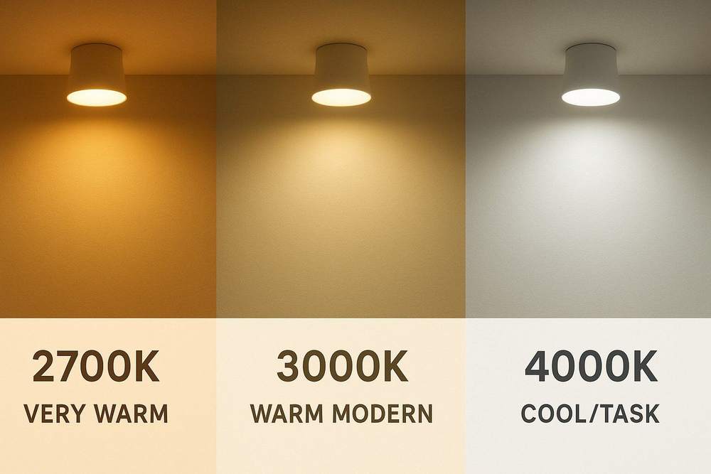
Whatever you choose, keep it the same across every fitting in one area. 3000K downlights next to 4000K strips is a common mismatch, and it makes a new kitchen look patchy. Pendants one step warmer than the downlights (2700K against 3000K) are fine, because they’re on their own circuit and mostly on at different times. Look for CRI 90 or above too: food, wood and stone all look better under it. There’s more on choosing in the kitchen colour temperature guide.
Modern kitchens
Modern kitchens are about clean lines, so the aim is light without visible hardware. It should look as if it comes from the room itself: slim downlights, hidden strips, and a pendant or two that reads as a simple shape.
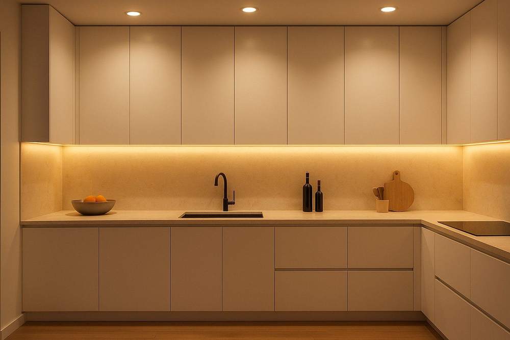
For the ceiling, integrated LED downlights with a slim or trimless bezel look cleanest, and every light stays the same colour, which matters in a pale kitchen where any difference shows. If there’s a room above, they need to be fire-rated under Approved Document B. Place them over the front edge of the worktops, about 60 cm out from the wall, rather than down the middle of the room. If you’re still choosing fittings, GU10 or integrated downlights compares the two.
Under the wall units, run LED strip in an aluminium profile with an opal diffuser, fixed towards the front of the cabinet so it lights the worktop and splashback evenly. Bare strip shows as a row of dots on a glossy worktop, and in a modern kitchen that’s the detail that gives it away. Use 400 to 600 lumens per metre alongside downlights, or up to about 800 if the strip is your main worktop light or the worktops are dark; the under-cabinet lighting guide has the detail.
Pendants should be simple shapes: opal globes, slim cylinders in matt black or white, or one linear bar over a long island. Two or three suit a standard island, hung 70 to 90 cm above the worktop. If joists stop you putting downlights where you want them, a matt black or white track with adjustable heads is a good modern alternative. Angle the heads at the worktops and splashback rather than straight down.
Use 3000K throughout. Cool white is what makes a modern kitchen feel clinical; warm white keeps the clean look without the chill. Then add a plinth strip, or a strip on top of the wall units, on its own switch for the evening.
Scandi and Japandi kitchens
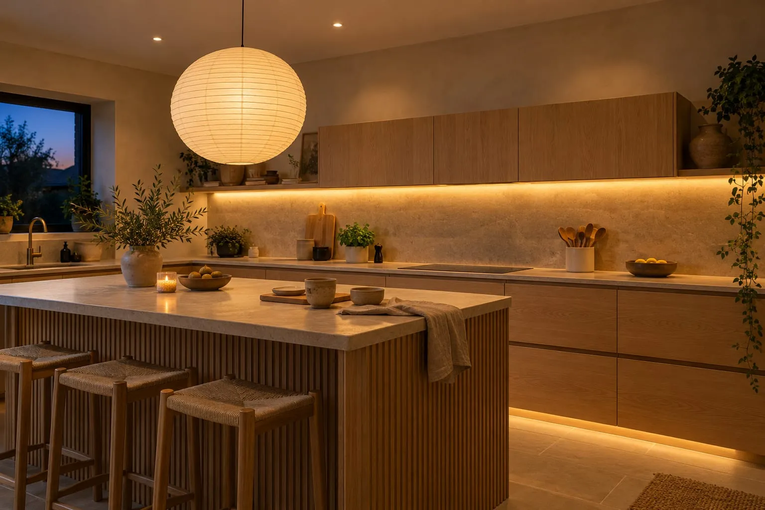
Scandi and Japandi are close cousins. Scandi is pale wood, white walls and as much daylight as you can get. Japandi adds Japanese restraint: warmer timber, plaster, stone, handmade ceramics and fewer, calmer pieces. Both look best under soft, diffused, warm light, and both lose their character under bright, hard light.
Use 3000K for the working light and 2700K for pendants and evening light. These kitchens are full of pale oak, ash and limestone, and warm light brings out the grain and the honey tones. Lit at 4000K, the same oak looks flat and slightly grey.
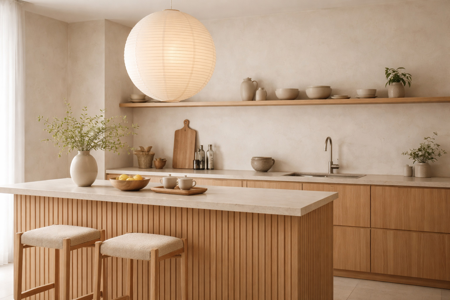
Keep the ceiling quiet. A few warm, slim downlights placed so the light falls down the cabinet fronts or a plaster wall look better than a full grid, because the light lands softly on surfaces instead of pointing at you. Where you have timber panelling or fluted fronts, a fitting set closer to the wall grazes the surface and makes the grain the feature.
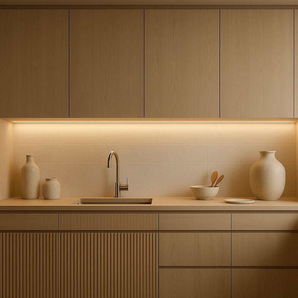
Under the wall units, the strip should be better hidden than in any other style: recessed into the cabinet base or tucked behind a lip, with a diffuser, so you see a soft glow on the splashback and never the strip itself. The same trick works under an island overhang, or behind the front edge of an open shelf to light ceramics.
Pendants are where the style shows. Paper lanterns, linen drums, opal glass, ceramic and pale wood all suit it, hung fairly low over an island or table. A big paper lantern is the classic Japandi pendant and one of the cheapest; a rice paper pendant shade costs from about £15. Use an LED bulb, which runs cool, and keep paper and fabric shades well away from the hob.

Scandi kitchens can take a little more contrast, such as black or white metal pendants, as long as the light is still diffused. Japandi is happiest with matt, natural finishes, so leave out polished chrome and anything glossy.
Dark kitchens and dark cabinetry
Navy, forest green, charcoal and black units look great, but they soak up light instead of reflecting it. A dark kitchen with the same downlights as a white one feels noticeably dimmer and heavier, and the usual reaction is to add more downlights. That rarely fixes it. The room feels heavy because the light isn’t landing on the surfaces you look at.
Start with the worktops. Under-cabinet strip matters more here than in any other style, because dark wall units leave the worktop below in deep shadow. Use 400 to 600 lumens per metre alongside downlights, up to about 800 if the strip is the main worktop light or the worktops are dark, with CRI 90 or above, in a diffused profile.
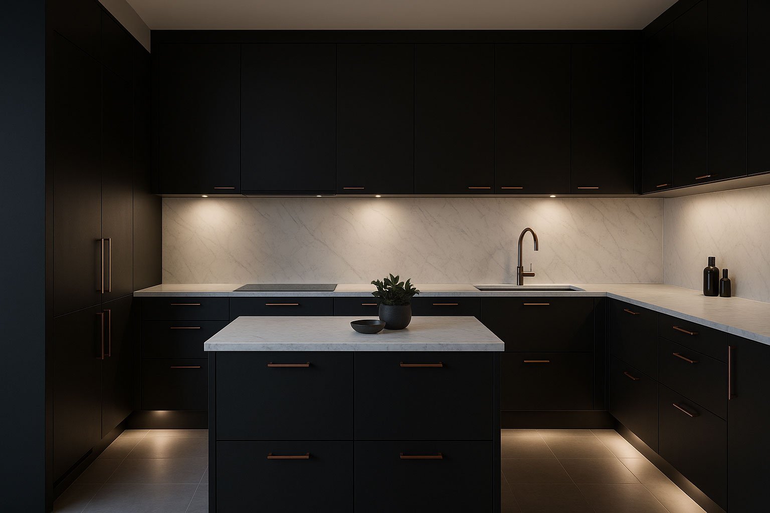
Then lift the walls and ceiling. If there’s a gap above the wall units, a strip on top of them bounces light onto the ceiling and stops the top of the room disappearing. A plinth strip on low output separates the base units from the floor so they look lighter.
Pendants give a dark kitchen its focal point. Opal glass glows against dark units, and brass or bronze adds warmth. Matt black disappears against black cabinets, which may or may not be what you want. Track heads angled at a stone or tiled splashback pick out the texture and give the eye somewhere bright to land.
Stay warm: 3000K for the working light and 2700K for the evening. Cool white makes navy look grey and black look flat. And watch out for gloss. High-gloss dark doors reflect every downlight as a bright spot, so keep the downlights over the worktop rather than directly in front of the doors, or choose matt or satin units if you’re still planning.
Industrial kitchens
Industrial kitchens borrow from warehouses and lofts: brick, concrete, steel and fittings you can see. The usual mix is a matt black track over the worktops, metal dome or cage pendants over the island, and perhaps a small cluster of exposed filament bulbs. The trick is to keep it warm, at 2700K to 3000K, because hard surfaces under cool light feel cold, and to use bare bulbs sparingly so they don’t glare.
There’s more on fittings, filament bulbs and lighting brick in the industrial kitchen lighting guide.
Cottage and farmhouse kitchens
Cottage and farmhouse kitchens are the warmest style of all: 2700K for most of the light, 3000K at most on the worktops. Rather than a grid of downlights, the light comes from pendants over the sink, island or table, wall lights by the range or dresser, and warm under-cabinet strip hidden well enough not to look modern. Aged brass, glass, ceramic and fabric shades suit it far better than chrome.
The cottage kitchen lighting guide covers fittings, low ceilings and beams in more detail.
What I'd buy
Affiliate linksFAQs
What lighting makes a kitchen look modern?
Slim or trimless integrated downlights, LED strip hidden under the wall units, and simple pendants, all at 3000K and on dimmers. Hiding where the light comes from does more than any single fitting.
What colour temperature suits a Japandi kitchen?
2700K to 3000K. Use 3000K for the worktops and 2700K for pendants and evening light. Avoid 4000K, which makes pale oak look flat and grey.
Do dark kitchens need brighter lights?
Not brighter overall, but better placed. Light the worktops with under-cabinet strip, bounce light off the ceiling and floor with strips above and below the units, and keep it warm. More downlights on their own make little difference.
Should a modern kitchen be warm or cool white?
Warm white, 3000K, suits most homes. 4000K can work in a very white kitchen that’s used mainly for cooking, but it feels clinical in the evening, especially in an open-plan room you also sit in.
Can I mix black fittings with oak or brass?
Yes. Matt black looks good against pale timber in a Scandi kitchen, and black with brass suits a dark kitchen. Stick to two finishes for the fittings in one room so it looks planned rather than collected.
 Save
Save it for later
Pin this guide to one of your Pinterest boards so it's there when you start the job.