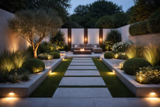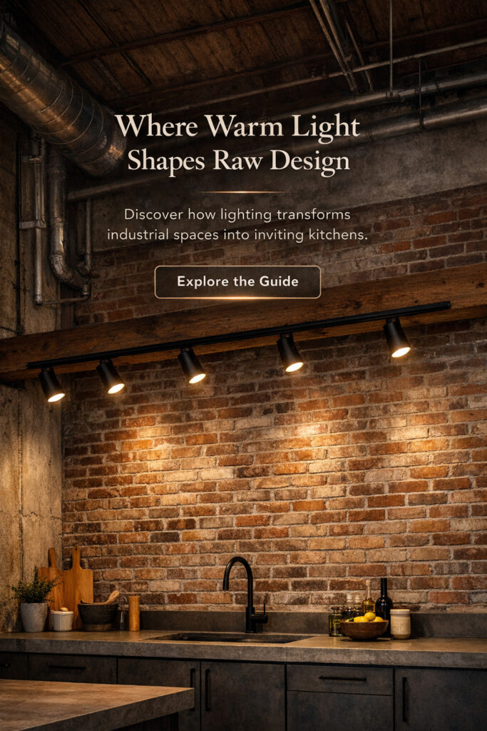
Scandi Japandi kitchen lighting focuses on simplicity, natural materials, and controlled light distribution. Timber finishes, neutral surfaces, and restrained colour palettes are typically supported by warm, diffused light rather than high contrast illumination.
In these kitchens, lighting plays a central role in how the space functions and appears. Fixture choice, placement, and colour temperature have more impact on the overall result than cabinetry or decorative features.
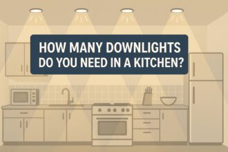
This article explores lighting from a style and inspiration perspective. For technical layout, brightness, and placement guidance, see our main kitchen lighting guide.
Lighting has a greater impact on the overall result than cabinetry or decorative features.
Scandi lighting = soft, diffused, warm lighting.
Japandi lighting = warm minimalism + natural materials.
Together, they are commonly used to create kitchens with reduced visual contrast.
Today we’ll explore:
- What makes a kitchen feel Scandi/Japandi
- The lighting temperatures that create softness
- Where to place lighting for natural reduced contrast
- Fixtures, materials + finishes that belong here
- How to layer light like a designer (simple steps)
- Mistakes that ruin the vibe
Internal link reference:
Table of Contents
What Makes Scandi Japandi Kitchen Lighting Different?
This style is built around warmth + nature + softness:
- reduced contrast neutral tones
- timber + oak + birch
- stone + clay + plaster texture
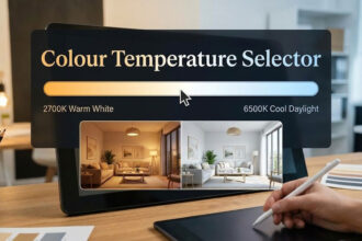
- soft 2700K–3000K lighting
- no blue and no clinical white
- diffused forms instead of shiny glitz
- minimal, but never cold
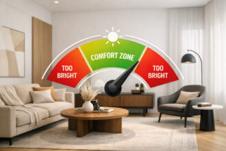
This lighting style typically uses diffused light to limit glare and hard shadows. The aim is to balance warmth with a restrained overall layout.
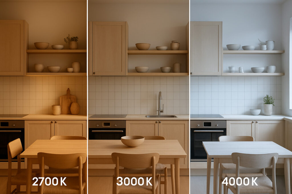
Recommended Colour Temperatures for Scandi and Japandi Kitchens
Scandi/Japandi kitchens warmer colour temperatures rather than cool, high contrast lighting.
Best colour temperatures:
| Mood | Ideal CCT |
|---|---|
| Evening warm lighting | 2700K |
| All-day reduced contrast modern | 3000K |
| Task clarity (occasionally) | 3500K (limited use) |
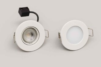
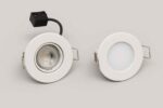
Core Lighting Layer 1 – Recessed Downlights
Soft-edged, slim-trim recessed downlights gently erase shadows without drawing attention.
They’re the invisible base layer — light without hardware.
Why recessed works here:
- visually quiet
- no clutter
- light falls naturally like daylight
- blends with timber + stone
- suits minimalist styling
Placement tips:
- 50–60cm from wall → washes cabinets softly
- never directly over your head → reduces face shadows
- space approx. half ceiling height apart
- warm 2700–3000K only
Recessed downlights are typically selected to remain visually unobtrusive.
If you are choosing between recessed and surface mounted fittings, this comparison of recessed vs surface mounted lights explains the differences.
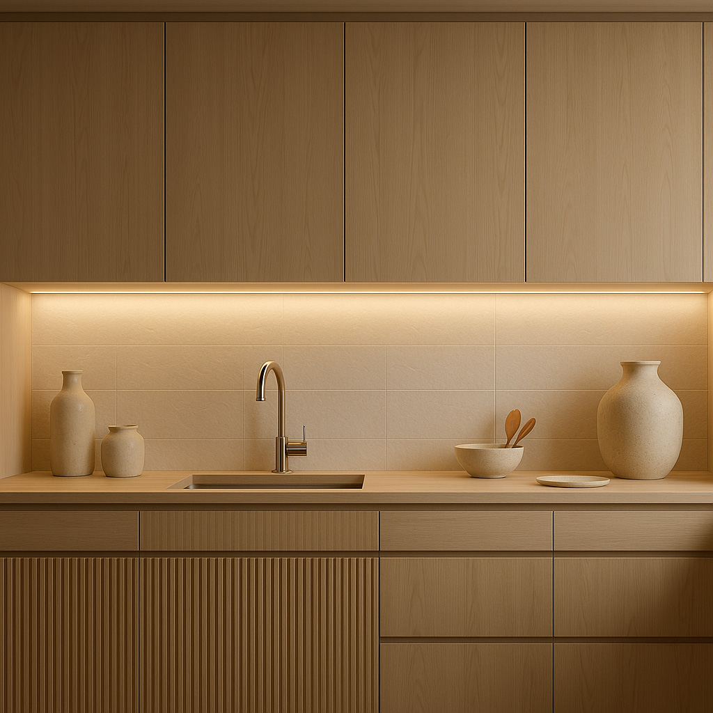
Core Lighting Layer 2 – LED Strip Lighting
LED strip lighting is commonly used to provide even, low-glare illumination across work and storage areas.
Best placements:
- Under wall cabinets → task clarity without harshness
- Above cabinets → atmospheric evening wash
- Under island overhang → floating reduced contrast
- Inside alcoves + shelves → highlight pottery, stone, wood
Brightness targets:
350–500 lm/m for prep zones
150–300 lm/m for ambience
LED strips help reduce visual contrast.
Hard shadows are typically avoided.
More LED education later here:
/guides/led-lighting/
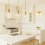
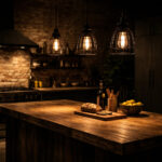
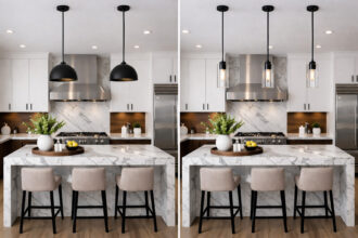
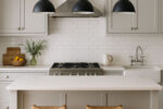
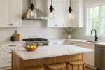
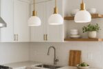
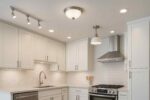
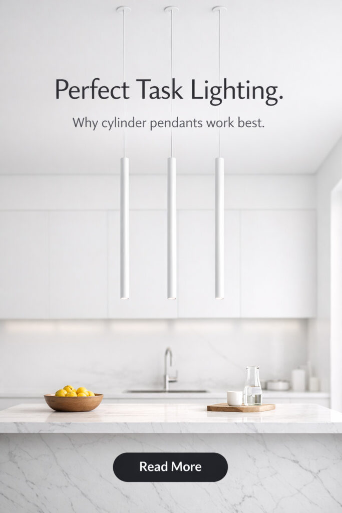
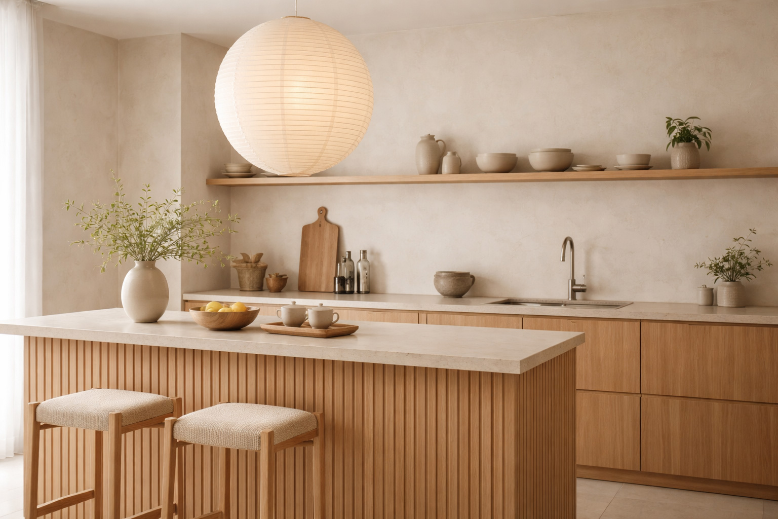
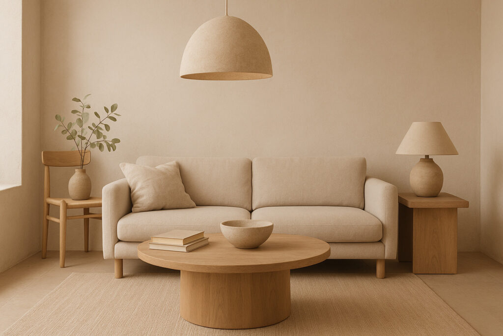
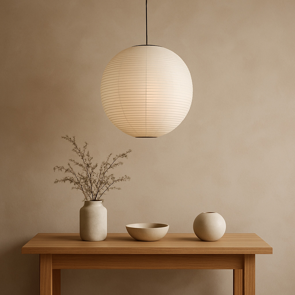
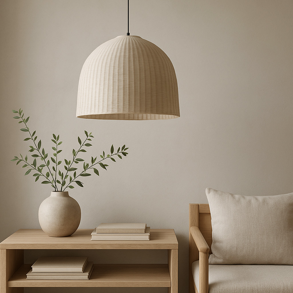
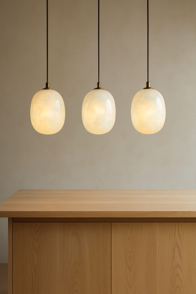
Core Lighting Layer 3 – Pendant Lighting
Pendants are the prominent feature of a Japandi kitchen — simple, sculptural, natural.
Beautiful shapes to use:
- Opal glass globes
- Linen / paper lantern pendants
- Slim cylinders in matte black
- Dome pendants in clay, sand, putty
- Raw metal or timber diffused shades
Placement:
- Over islands → 2 or 3 spaced evenly
- Height → 70–90cm above surface
Pendants are typically dimmable to allow lower brightness settings in the evening.
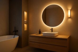
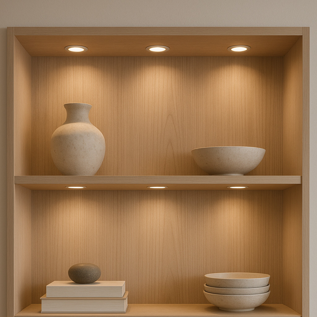
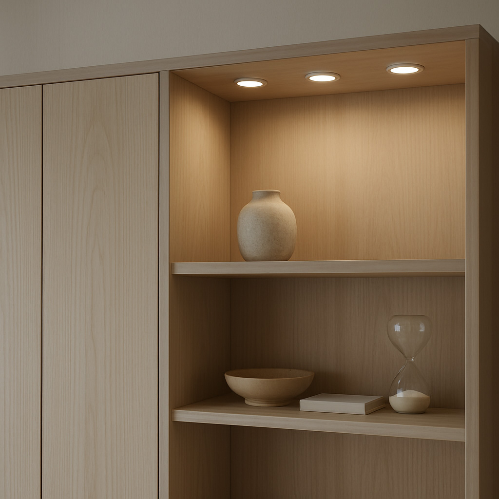
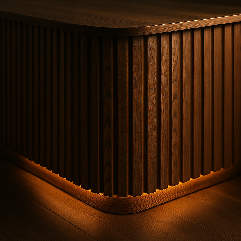
Accent Lighting – Secondary Lighting Layer
Scandi + Japandi rooms aren’t bright… they’re layered.
Accent lighting is used to highlight surface texture.
Use light to highlight:
- Slatted timber panelling
- Textured splashbacks
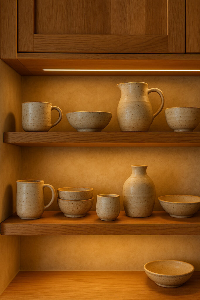
- Handmade ceramic shelving
- Niche cutouts & vertical grain doors
Try wall-washing track heads or strips hidden behind lips.
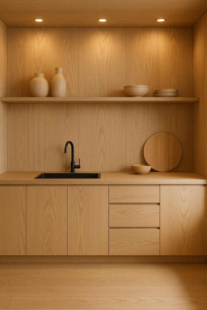
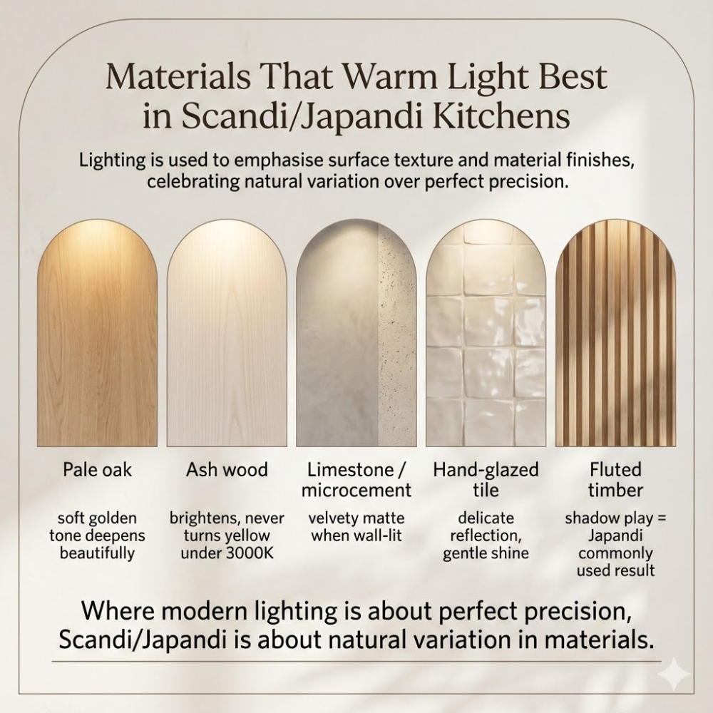
Materials That Warm Light Best in Scandi/Japandi Kitchens
Lighting is used to emphasise surface texture and material finishes.
Best texture pairings:
| Material | Warm light behaviour |
|---|---|
| Pale oak | soft golden tone deepens beautifully |
| Ash wood | brightens, never turns yellow under 3000K |
| Limestone / microcement | velvety matte when wall-lit |
| Hand-glazed tile | delicate reflection, gentle shine |
| Fluted timber | shadow play = Japandi commonly used result |
Where modern lighting is about perfect precision, Scandi/Japandi is about natural variation in materials.
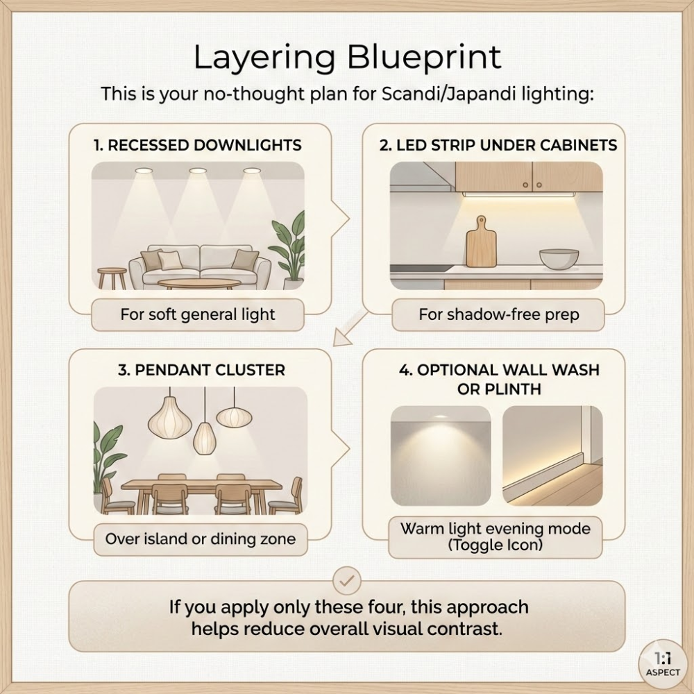
Layering Blueprint
This is your no-thought plan for Scandi/Japandi lighting:
- Recessed downlights for soft general light
- LED strip under cabinets for shadow-free prep
- Pendant cluster over island or dining zone
- Optional wall wash or plinth warm light evening mode
If you apply only these four, this approach helps reduce overall visual contrast.
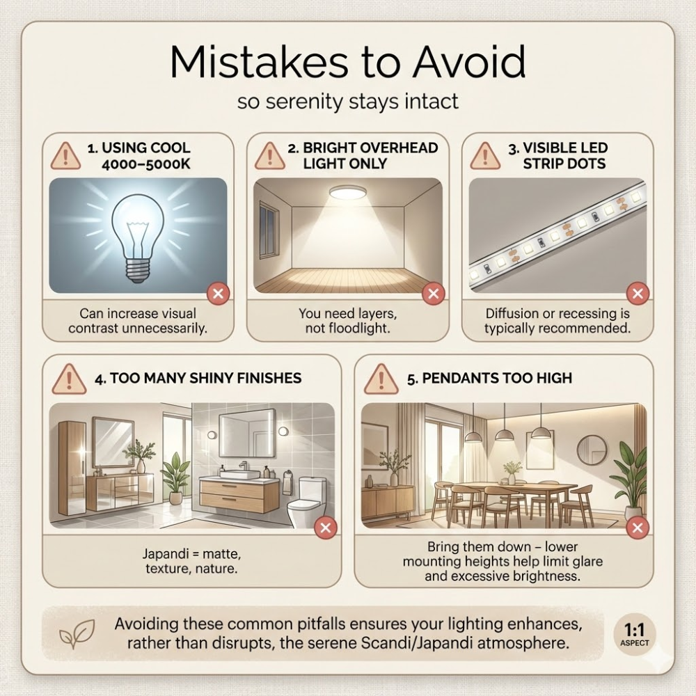
Mistakes to Avoid – so serenity stays intact
- Using cool 4000–5000K – Can increase visual contrast unnecessarily.
- Bright overhead light only – You need layers, not floodlight.
- Visible LED strip dots – Diffusion or recessing is typically recommended.
- Too many shiny finishes – Japandi = matte, texture, nature.
- Pendants too high – Bring them down – lower mounting heights help limit glare and excessive brightness.
For broader planning issues beyond this style, see our guide to kitchen lighting mistakes.
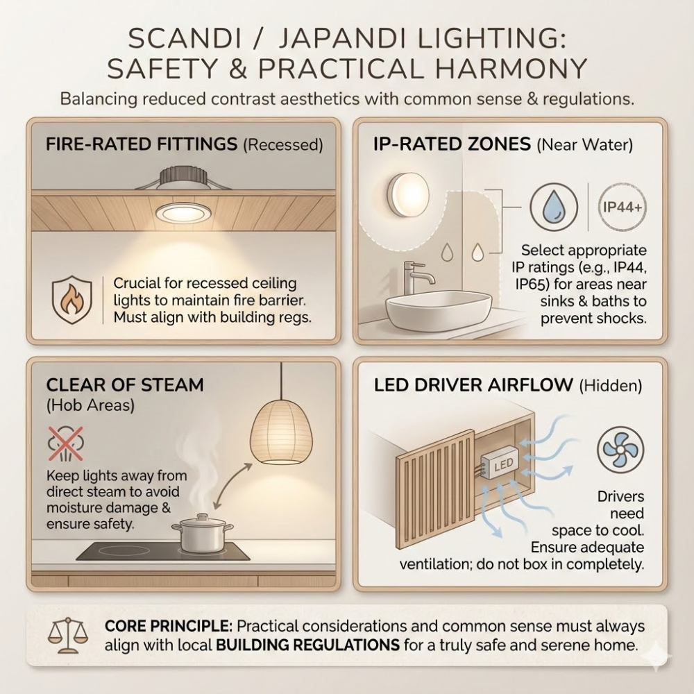
Safety Notes – Practical Considerations
Because reduced contrast still needs common sense:
- Fire-rated fittings if recessed through ceilings
- Choose IP-rated lights near sinks
- Keep lights clear of steam rising from hob
- LED drivers need airflow
Practical considerations should always align with building regulations.
FAQ – People Also Ask
Q1: What light temperature suits Scandi/Japandi?
2700K–3000K is commonly used for Scandi and Japandi kitchens.
Q2: Are pendants essential?
Not essential, but commonly used over islands or dining areas.
Q3: Can I mix black fixtures with timber?
Yes – black is grounding in warm neutral kitchens.
Q4: How can lighting be adjusted for evening use?
Use dimmable lighting and reduce reliance on overhead fittings.
Q5: Is this style good for small kitchens?
Reduced contrast and simpler lighting layouts can help smaller kitchens appear more spacious.
Conclusion
Scandi and Japandi kitchen lighting is typically planned around warm colour temperatures, diffused light sources, and simple fixture forms. Recessed downlights, LED strip lighting, and pendants are used in combination to provide functional illumination while limiting glare and contrast.
Consistent colour temperature, usually between 2700K and 3000K, helps these lighting layers work together across the space. When lighting is planned alongside materials and layout, Scandi and Japandi kitchens remain practical while maintaining a restrained, natural appearance.
For general household electrical safety guidance in the UK, see Electrical Safety First.