CRI vs colour temperature: what's the difference?



Mike's quick answer
Colour temperature is the colour of the light, warm or cool. CRI is how true colours look under it, out of 100. They're independent, so pick the colour temperature for the mood of the room and look for CRI 90 or more wherever you look at food, faces or clothes.
Two numbers on an LED box decide how the light will look. Colour temperature, in kelvin, tells you whether the light is warm and yellowish or cool and bluish. CRI, the colour rendering index, tells you how faithfully that light shows the colours of things under it.
They measure different things, and neither tells you anything about the other. A warm 2700K bulb can make a red sofa look rich or muddy depending on its CRI, and a cold 6500K daylight bulb can have a poor CRI despite sounding “natural”. Choose the colour temperature for how the room should feel, and the CRI for how accurate colours need to be.
The difference at a glance
| Colour temperature | CRI | |
|---|---|---|
| What it tells you | The colour of the light | How true colours look under it |
| Measured in | Kelvin (K) | A score out of 100 |
| Higher number | Cooler, bluer light | More accurate colours |
| Lower number | Warmer, more amber light | Duller, shifted colours |
| Mostly affects | Mood and atmosphere | Food, skin, fabrics, paint |
| For most homes | 2700K–3000K, up to 4000K in work areas | 80 minimum, 90+ in kitchens and bathrooms |
What colour temperature measures
Colour temperature describes the tone of white light. Low numbers look warm: 2700K is the soft, slightly yellow light of an old filament bulb. 3000K is still warm but cleaner. 4000K is a crisp, neutral white, and 5000K to 6500K looks increasingly blue-white, like daylight.
It sets the mood of a room. Warm light feels relaxed; neutral and cool light feels practical and alert. What it doesn’t tell you is whether a tomato will look red or brownish under it. The full explanation, with room-by-room advice, is in the colour temperature guide.

What CRI measures
CRI compares how a set of test colours look under a light with how they look under a reference light of the same colour temperature: a filament-type source below 5000K, and daylight above it. The closer the match, the higher the score, up to 100. Old filament and halogen bulbs score close to 100, which is why colours always looked natural under them, and why cheap early LEDs looked so flat by comparison.
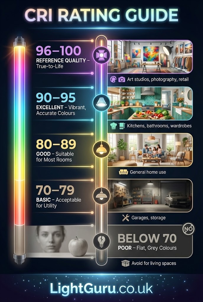
In practice the scores fall into bands. Below 70, colours look noticeably dull and skin can look grey; you’ll find this in the cheapest LEDs and old fluorescent tubes. 80 to 89 is fine for most rooms and what most decent LED bulbs give. 90 and above shows reds, skin tones and wood properly, and it’s what I’d want anywhere you prepare food, do make-up or choose clothes.
Why they get mixed up
Both change how a room looks, so they’re easy to blur together. The way to keep them apart is to think of colour temperature as the tint over everything, and CRI as how much detail survives under that tint.
Change the colour temperature and the whole room shifts: warmer, cosier, or cooler and more clinical. Change the CRI at the same colour temperature and the room has the same overall tone, but colours lose or gain their depth. Red cushions go from red to rust. A wooden table goes from warm oak to flat brown. Faces look healthy or slightly grey.
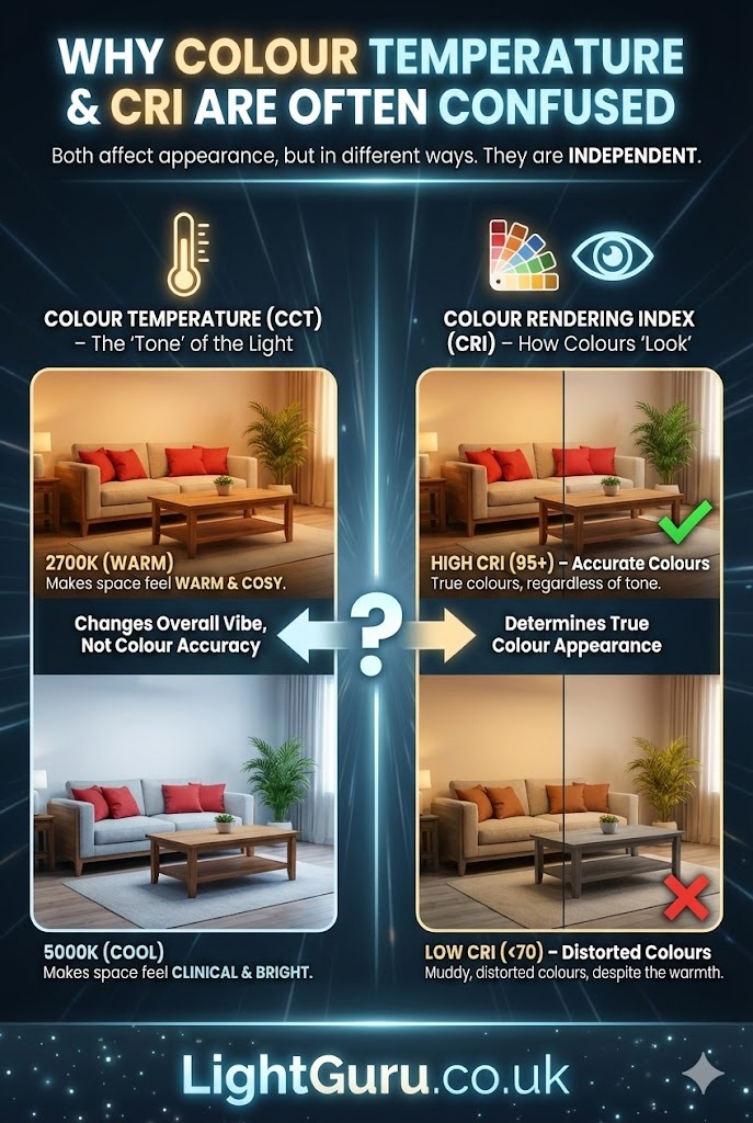
That’s also why a “daylight” bulb isn’t automatically accurate. 6500K describes the colour of the light, not its quality. A cheap daylight bulb can be CRI 80 or lower, and colours under it look cold and washed out at the same time.
R9 and the limits of CRI
The standard CRI figure, sometimes written Ra, is an average of eight fairly muted test colours. It leaves out the strong red, R9, and that’s the one that makes skin, meat, tomatoes and warm woods look right. A bulb can score CRI 80 overall and still render reds poorly.
Better manufacturers now list R9 separately. If it’s given, look for R9 above 50 for kitchens, bathrooms and anywhere colour matters. On professional spec sheets you may also see TM-30 figures, a newer and more detailed way of measuring colour quality. For home use, CRI plus R9 tells you enough.
What to choose for each room
| Room | Colour temperature | CRI |
|---|---|---|
| Living room | 2700K–3000K | 80 minimum, 90 preferred |
| Kitchen | 3000K–4000K | 90 or more |
| Bathroom | 3000K–4000K | 90 or more, especially at the mirror |
| Bedroom | 2700K | 80, or 90 by a wardrobe or dressing table |
| Home office | 4000K at the desk | 80, or 90 if you work with colour |
| Garage or workshop | 5000K–6500K | 80 |
| Outside | 2700K–3000K | 80 is plenty |
Kitchens and bathrooms are where high CRI earns its money. In a kitchen, food looks fresher and you can see whether meat is cooked; the kitchen colour temperature guide covers which white to pair with it. In a bathroom, the mirror light is the one to get right, because low CRI makes make-up and skin hard to judge. The bathroom mirror lighting guide covers placement.
In living rooms, CRI 90 is a nice upgrade rather than a must, and it shows most on artwork, fabrics and wood floors. Outside, accuracy matters least, unless you eat outdoors a lot.
What to look for when buying
Check both numbers, every time. Good brands print the Kelvin figure and the CRI on the box or in the listing. If CRI isn’t mentioned anywhere, assume it’s around the minimum.
For high CRI, look at the better ranges from the big names rather than the cheapest multipacks. The Philips Master and Osram Parathom ranges include CRI 90 GU10s, and many integrated downlights from brands like Aurora quote CRI 90 or 95. If you’re weighing up bulbs against built-in fittings, the comparison in GU10 vs integrated downlights covers colour consistency as well.
Keep everything in one room matched: same colour temperature, same CRI, ideally the same brand and batch. A row of downlights where one bulb has a different CRI will look slightly off even if the Kelvin figure is the same. My own bulb picks, with CRI noted, are in the best LED bulbs guide.

FAQs
What CRI is good for a home?
80 or above for general rooms, and 90 or above in kitchens, bathrooms and anywhere you judge colours, such as a dressing area or craft room.
Is CRI 80 good enough?
For living rooms, bedrooms and hallways, yes. Most people won’t notice a problem day to day. In kitchens and at a bathroom mirror, CRI 90 makes a visible difference to food and skin.
Does colour temperature affect CRI?
No. They’re separate measurements. A 2700K bulb can be CRI 80 or CRI 95, and so can a 6500K one. Check both.
What is R9?
R9 is how well a light shows strong red. It isn’t included in the standard CRI average, so a bulb can have a decent CRI and still make reds look dull. For kitchens and bathrooms, look for R9 above 50 where it’s listed.
What does 930 mean on a bulb?
It’s a colour code: the 9 means CRI 90 or more, and 30 means 3000K. 827 would be CRI 80-something at 2700K; 940 would be CRI 90 at 4000K.
Does CRI matter for outdoor lighting?
Not much. For paths, drives and security lights, CRI 80 is plenty. It’s worth a better CRI over an outdoor dining table, where you’ll be looking at food and faces.
 Save
Save it for later
Pin this guide to one of your Pinterest boards so it's there when you start the job.