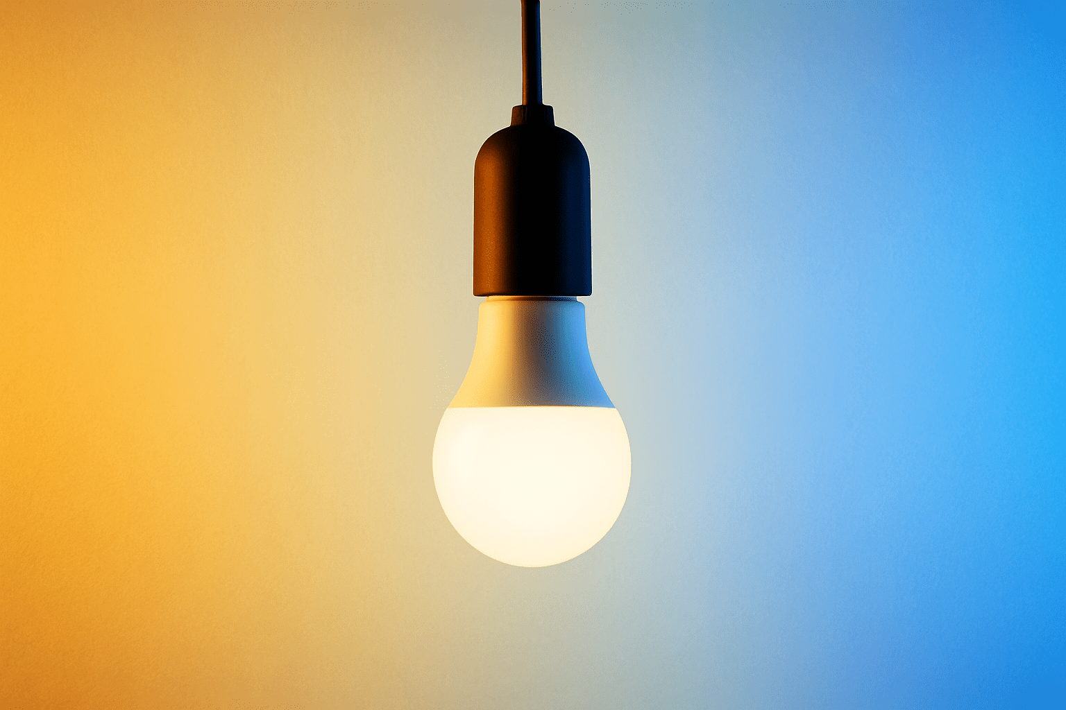
What is colour temperature? If you have ever switched on a new bulb and thought the light felt too yellow or too blue, you have already experienced it. Colour temperature plays a bigger role in how your home looks and feels than most people realise.
Colour temperature describes the tone of light a bulb produces. It is measured in Kelvins (K) and ranges from warm amber tones at the low end to crisp blue-white light at the high end. It has nothing to do with how hot a bulb gets. Instead, it tells you whether the light will feel cosy and relaxing or bright and energising.
Getting this right matters because the wrong colour temperature can make a beautifully decorated room feel cold and clinical, or dull and dated. The right choice makes paint colours look true, highlights your furniture and finishes, and supports the way you actually use each space.
This guide explains how colour temperature works, what the Kelvin scale means in practical terms, how to choose the right tone for every room, and how colour temperature relates to other lighting concepts like brightness and colour rendering. If you are planning any lighting project, from a quick bulb swap to a full renovation, this is the foundation to get right first.
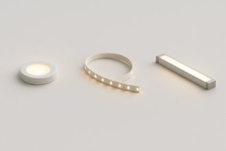
If you want to compare colour temperatures visually before buying, our colour temperature selector lets you preview warm, neutral, and cool white side by side.
Table of Contents
What Colour Temperature Actually Means
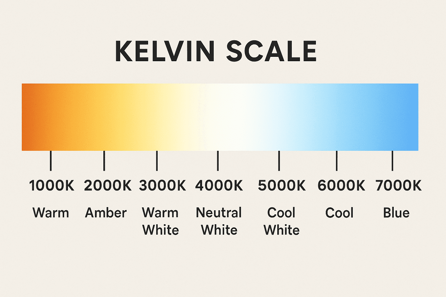
Colour temperature is a way of describing the visual warmth or coolness of a light source. It is measured using the Kelvin scale, where lower numbers produce warmer, more amber-toned light and higher numbers produce cooler, whiter or bluish light.
The concept comes from physics. When a theoretical “black body” object is heated, it glows different colours at different temperatures, starting with deep red, moving through orange and yellow, then into white and eventually blue. The Kelvin values on your LED packaging correspond to these colours, even though the LED itself is not getting that hot.
In practical terms, here is what you will see across the range:
1800K to 2200K – Very warm amber light, similar to candlelight or vintage filament bulbs. This range creates an intimate, low-key atmosphere and is popular in restaurants, bedrooms, and decorative accent lighting.
2700K to 3000K – Warm white. This is what most people think of as traditional home lighting. It feels cosy and inviting without being too yellow. It suits living rooms, bedrooms, hallways, and dining areas, and is the most popular choice for residential spaces across the UK.
3500K to 4000K – Neutral white. This sits between warm and cool, offering a clean, balanced appearance with no strong yellow or blue cast. It works well in kitchens, bathrooms, utility rooms, and transitional spaces where you want clarity without harshness.
5000K to 6500K – Cool white to daylight. These higher values mimic natural midday sunlight and produce a bright, crisp, slightly blue-toned light. They are ideal for task-heavy environments like home offices, workshops, garages, and studios where you need accurate colour perception and high alertness.
The key takeaway is that colour temperature is about the tone of light, not its intensity. A 2700K bulb and a 5000K bulb can both produce the same number of lumens and therefore the same brightness, but they will look and feel completely different in a room.
The Kelvin Scale Explained
The Kelvin scale is your roadmap when shopping for LED bulbs. Understanding what is colour temperature starts here, because the Kelvin values printed on packaging tell you exactly what tone of light to expect. The scale runs from around 1800K at the warmest end to 6500K or higher at the coolest. Once you understand the key points on the scale, choosing the right bulb becomes straightforward.
Here is how the most common Kelvin values translate into real-world lighting:
1800K – Deep amber glow. Think candlelight dinners, fairy lights, and decorative Edison bulbs. This is mood lighting at its warmest.
2700K – Classic warm white. This is the colour most UK homes have been lit with for decades, first through incandescent bulbs and now through warm white LEDs. If you want a living room or bedroom to feel relaxed and homely, 2700K is the safe choice.
3000K – Soft warm white. Slightly cleaner than 2700K but still firmly in the warm camp. Popular in hallways, lounges, and open-plan living spaces where you want warmth with a touch more definition.
4000K – Neutral white. Neither warm nor cool, this produces a fresh, balanced light. It is the standard recommendation for kitchens and bathrooms where you need to see clearly without the light feeling cold. For detailed guidance on kitchen lighting, see our kitchen colour temperature guide.
5000K – Daylight. Mimics natural sunlight on a clear day. Commonly used in home offices, studios, and craft spaces where colour accuracy and focus matter.
6500K – Cool daylight. Bright and slightly blue, this is typical of commercial and retail environments. In a home setting, it can feel too clinical for most rooms but has niche uses in garages, workshops, and utility areas.
One important point that trips people up: the Kelvin scale describes the colour of light, not how bright it is. Brightness is measured in lumens. You can have a dim warm light or a very bright warm light, both at 2700K but with different lumen outputs. For help working out the right brightness for each room, our guide on how many lumens you need includes a free room calculator.

| Feature | Warm White (2700–3000K) | Cool White (4000–6500K) |
| Colour Tone | Yellow / Amber | White / Blueish |
| Mood | Relaxing, cozy, soft | Energising, bright, clean |
| Best For | Living rooms, bedrooms | Kitchens, bathrooms, offices |
| Common Label | “Soft White” | “Daylight” / “Cool White” |
Warm White vs Cool White vs Daylight
These are the three terms you will see most often on LED packaging in the UK. If you are still asking what is colour temperature in practical shopping terms, this is where it clicks – the difference between warm white, cool white, and daylight is the most useful thing you can learn.
Warm white (2700K to 3000K) produces a soft, yellowish glow that makes spaces feel relaxed and welcoming. It flatters skin tones, softens shadows, and works well with natural materials like wood, stone, and textured fabrics. Most people find warm white the most comfortable tone for evening use and for rooms where the priority is relaxation, such as living rooms, bedrooms, and dining areas. If you are planning your living room lighting, our living room lighting guide covers how to layer warm light across different sources for the best result.
Cool white (4000K to 5000K) produces a cleaner, more neutral light with no noticeable yellow or blue tint. It is brighter-feeling to the eye even at the same lumen output, because the human eye is more sensitive to light in this spectrum. Cool white is the standard recommendation for kitchens, bathrooms, and task areas where visibility and clarity are important. For bathroom-specific advice, our bathroom lighting guide explains how to balance cool task lighting with warmer ambient layers.
Daylight (5000K to 6500K) replicates the quality of natural midday sunlight. It has a slightly blue-white cast and provides excellent colour accuracy, making it the top choice for spaces where you need to see true colours, such as home offices, art studios, sewing rooms, and workshops. Daylight bulbs can feel harsh in living areas, so they are best reserved for task-specific zones.
The differences between these three ranges are not subtle. Putting a 6500K daylight bulb in a bedroom creates a stark, hospital-like feel. Putting a 2700K warm white bulb above a bathroom mirror makes it harder to see clearly for grooming. Matching the colour temperature to the room’s function is one of the simplest ways to improve how your home feels.

How to Choose the Right Colour Temperature for Each Room
Every room in your home has a different purpose, and the colour temperature should reflect that. Once you understand what is colour temperature and how it changes the feel of a space, matching it to each room becomes straightforward. Here is a practical breakdown of what works where and why.
Living room – 2700K to 3000K. The living room is primarily a relaxation space, so warm white is the natural fit. It creates the soft, inviting atmosphere most people want for evenings spent watching television, reading, or socialising. If your living room doubles as a home office during the day, consider smart bulbs with tunable white so you can shift from warm evening light to a brighter, cooler tone during working hours.
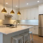
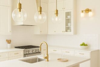
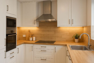
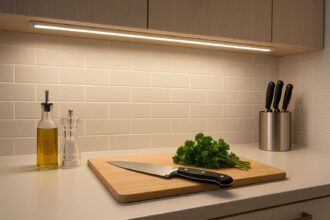
Kitchen – 3000K to 4000K. Kitchens need clarity for food preparation and cleaning, so neutral white is the standard recommendation. A colour temperature of 4000K ensures worktops are well lit and food colours look accurate, which matters more than people expect when cooking. Many kitchens benefit from a layered approach: 4000K for ceiling downlights and under-cabinet task lighting, with 3000K for pendant lights over an island or dining area to create warmth. For specific kitchen guidance, our kitchen lighting ideas guide covers layout, layering, and fitting choices in detail. Our article on lumens for kitchen lighting will help you get brightness right alongside colour temperature.
Bathroom – 3000K to 4000K. Bathrooms require clear, accurate light, particularly around the mirror for grooming and makeup. 4000K neutral white is a good compromise here, providing crisp visibility without feeling stark. For ambient layers such as LED strips in shower niches or bath surrounds, dropping down to 3000K adds warmth and makes the space feel more spa-like. Bathroom lighting also involves IP ratings and zone regulations, which our bathroom zones and IP ratings guide covers thoroughly.
Bedroom – 2700K. Sleep quality is closely linked to light exposure, and warm white at 2700K supports your body’s natural wind-down process in the evening. Avoid anything above 3000K in bedrooms unless you have a specific task area like a dressing table where slightly cooler light helps with accuracy.
Home office or study – 4000K to 5000K. Focus and alertness improve under cooler, brighter light. A colour temperature of 5000K mimics daylight and helps reduce eye strain during long working sessions. If your office is part of a bedroom or living room, tunable white bulbs allow you to switch between work mode and relaxation without changing fittings.
Hallways and stairs – 2700K to 3000K. These transitional spaces benefit from warm light that matches the rooms they connect. Bright, cool light in a hallway can feel jarring when you step in from a warm living room.
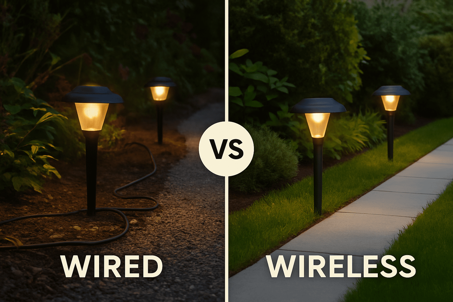
Garden and outdoor – 2700K to 4000K. Outdoor lighting colour temperature depends on the purpose. Pathway and ambient garden lighting at 2700K to 3000K creates a warm, welcoming glow. Security lighting and functional areas like bin stores or driveways can use 4000K for better visibility. Our garden lighting ideas guide covers layout, types, and colour temperature for outdoor spaces.
| Range | Appearance | Example Use |
|---|---|---|
| 1800K | Candlelight glow | Restaurants, ambient lighting |
| 2700K | Warm White | Living rooms, bedrooms |
| 3000K | Soft White | Hallways, lounges |
| 4000K | Neutral White | Kitchens, bathrooms |
| 5000K | Daylight | Offices, studios |
| 6500K | Cool Daylight | Retail, outdoor security |
For more technical insight into lighting design, refer to the CIBSE Lighting Guide a trusted professional resource for lighting standards.
Learn more about LED lighting standards from Lighting Europe
Colour Temperature and Brightness – Understanding the Difference
This is the single most common point of confusion. Colour temperature and brightness are two completely independent properties of light, and understanding the difference will save you from buying the wrong bulbs.
Colour temperature (measured in Kelvins) describes the tone of the light, how warm or cool it appears. Brightness (measured in lumens) describes how much light a source actually produces, how much of it fills the room.
A 2700K bulb and a 5000K bulb can both produce 800 lumens and therefore deliver the same amount of light. But the 5000K bulb will feel brighter to your eye because human vision is more sensitive to light in the blue-white spectrum. This is why many people mistakenly believe cool white light is brighter. The perceived brightness increases even when the measured output is identical.
This matters practically because it means you may need slightly more lumens from warm white bulbs to achieve the same visual impact as cool white ones, especially in task areas. For a full breakdown of how many lumens you need in each room, our guide on choosing LED brightness for each room explains the calculation step by step.
The old habit of buying bulbs by wattage does not help here either. Wattage measures energy consumption, not light output. A 7W LED can produce more lumens than a 60W incandescent bulb. Always check the lumen rating and Kelvin value on the packaging, and ignore wattage as a measure of brightness.

| Room | Ideal Temperature | Why It Works |
|---|---|---|
| Living Room | 2700K–3000K | Creates a warm, inviting atmosphere |
| Kitchen | 4000K | *Clear, bright light for cooking |
| Bathroom | 4000K–5000K | Crisp, clean reflection for mirrors |
| Bedroom | 2700K | Relaxing and gentle before sleep |
| Office / Study | 5000K–6500K | Boosts focus and productivity |
| Outdoor | 3000K–4000K | Balanced visibility and ambience |
CRI and Colour Temperature – How They Work Together
Alongside colour temperature, there is another specification worth understanding: the Colour Rendering Index, or CRI. While colour temperature describes the tone of the light, CRI measures how accurately that light reveals the true colours of objects beneath it.
CRI is rated on a scale from 0 to 100, where 100 represents perfect colour rendering under natural sunlight. Most quality LEDs offer a CRI of 80 or above, which is acceptable for general home use. For kitchens, bathrooms, and any space where you need to see colours accurately, such as when preparing food, applying makeup, or choosing clothes, aim for CRI 90 or higher.
Here is why this matters in combination with colour temperature. You could have a 4000K bulb with a CRI of 70 and another 4000K bulb with a CRI of 95. Both produce the same neutral white tone, but food on a worktop, skin tones in a bathroom mirror, and paint colours on a wall will look noticeably different under each one. The higher CRI bulb shows colours closer to how they appear in natural daylight.
When buying LEDs, check both the Kelvin rating and the CRI. A common mistake is choosing a great colour temperature but ending up with a low CRI bulb that makes everything look washed out. For a deeper look at this topic, our full guide to CRI vs colour temperature explains the differences and how to choose the right combination for each space.
Common Myths About Colour Temperature
There are several persistent misconceptions about colour temperature that lead people to make poor lighting choices. Part of understanding what is colour temperature means knowing what it is not. Here are the most common myths, and why they are wrong.
Myth: Cool white light is brighter than warm white. This is probably the most widespread misunderstanding. Brightness is determined by lumens, not by Kelvin value. A 2700K warm white bulb and a 5000K cool white bulb with identical lumen outputs produce the same amount of light. The cool white version appears brighter to the human eye because we are more sensitive to blue-white wavelengths, but the actual measured light output is the same. If your warm white room feels dim, the issue is lumens, not colour temperature.
Myth: Warm white light looks old-fashioned. This may have been true with old incandescent bulbs that had a limited, deep yellow tone. Modern warm white LEDs at 2700K to 3000K produce a cleaner, more refined warm tone that works beautifully with contemporary interiors. The vast majority of high-end residential and hospitality projects specify warm white lighting precisely because it flatters materials, skin tones, and room finishes.
Myth: Daylight bulbs are always the best choice. Daylight (5000K to 6500K) bulbs excel at colour accuracy and task visibility, but they are not universally ideal. Using daylight bulbs in a living room or bedroom can make the space feel cold, institutional, and unwelcoming. The right colour temperature depends entirely on the function of the room and the atmosphere you want to create. There is no single “best” setting.
Myth: You should use the same colour temperature everywhere. While consistency within a single room is important, different rooms have different needs. A 4000K kitchen and a 2700K living room can sit side by side perfectly comfortably. Problems arise when you mix noticeably different temperatures within the same space, such as having 3000K pendants and 5000K downlights in the same kitchen. That creates a visually jarring effect. Match within rooms, but feel free to vary between them.
Myth: Colour temperature affects your electricity bill. It does not. Colour temperature has no relationship to energy consumption. A 2700K LED and a 5000K LED of the same wattage use exactly the same amount of energy. Energy efficiency depends on the type of bulb (LED vs halogen vs incandescent), wattage, and how many hours it runs, not on whether the light is warm or cool.
Myth: Higher Kelvin means higher quality. Kelvin is a measure of colour tone, not quality. A cheap 5000K bulb is not better than a quality 2700K one. Quality in LED lighting is determined by factors like CRI, lumen output, lifespan, flicker rate, and build quality, none of which correlate with colour temperature.
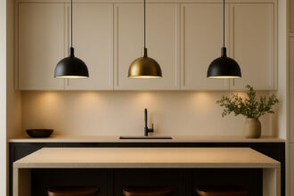
Mixing Colour Temperatures in the Same Space
A common question is whether you can use different colour temperatures in the same room. The short answer is yes, but you need to do it deliberately and carefully.
The most successful approach is to keep all light sources within the same functional zone at a consistent colour temperature, and only vary between zones that serve different purposes. For example, in an open-plan kitchen-diner, you might use 4000K for ceiling downlights and under-cabinet strips in the cooking zone, and 3000K for pendant lights over the dining table. This creates natural visual separation between the two areas and feels intentional.
What does not work is randomly mixing colour temperatures. Having a 2700K table lamp next to a 5000K floor lamp in the same living room creates an uncomfortable visual clash where the lights appear to be fighting each other. Keep the temperature gap to no more than 500K within the same visible area unless the zones are clearly defined.
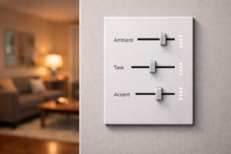
For rooms that need to serve multiple purposes at different times of day, tunable white smart bulbs are the best solution. These allow you to adjust colour temperature on demand without changing any fittings. Our guide to smart kitchen lighting scenes shows how this works in practice, with presets for cooking, dining, and cleaning that each use a different colour temperature.
Smart Lighting and Tunable White
Modern smart LED bulbs have made colour temperature far more flexible than it used to be. Tunable white bulbs can shift across a wide Kelvin range, typically from 2200K to 6500K, controlled from an app, voice assistant, or physical switch.
This technology is particularly useful in three situations. First, multi-purpose rooms like open-plan kitchen-diners or bedrooms that double as home offices benefit from being able to switch between warm and cool light without rewiring. Second, tunable white supports circadian lighting, where you use cooler, brighter light during the day and shift to warmer, dimmer light in the evening to support natural sleep patterns. Third, it eliminates the guesswork when you move into a new home, as you can experiment with different colour temperatures before committing.
When shopping for tunable white bulbs, check the range they cover. Some budget options only shift between 2700K and 4000K, which limits their usefulness. For full flexibility, look for a range of at least 2200K to 5000K with smooth dimming at both ends.
Frequently Asked Questions (FAQ)
What is the best colour temperature for home lighting?
For most rooms in a typical UK home, 2700K to 3000K warm white is the most comfortable and versatile choice. It creates a welcoming atmosphere that suits living rooms, bedrooms, hallways, and dining areas. For kitchens, bathrooms, and home offices where task clarity is more important, 4000K to 5000K provides a cleaner, brighter tone. The best approach is to match colour temperature to each room’s primary function rather than picking one setting for the entire house. This is the most practical answer to what is colour temperature for anyone setting up lighting at home.
Is warm white or cool white better for the kitchen?
Most kitchen designers recommend 4000K neutral white for ceiling and task lighting, as it provides clear visibility for food preparation and cleaning without feeling overly harsh. If your kitchen has a dining or socialising area, warmer pendants at 3000K over the table or island create a nice contrast. Pairing a high CRI (90+) with 4000K ensures food colours look natural. For more specific advice, our kitchen colour temperature guide goes into this in detail.
Does colour temperature affect mood and wellbeing?
Research consistently shows that light colour influences how alert, relaxed, and comfortable people feel. Cooler, bluer light (4000K and above) promotes alertness and concentration, making it useful for workspaces and morning routines. Warmer light (2700K to 3000K) encourages relaxation and supports the body’s natural production of melatonin in the evening, helping with sleep. Spending extended time under very cool light at night can disrupt sleep patterns, which is one reason many sleep experts recommend warm lighting in bedrooms and living rooms after dark.
What does 4000K light look like?
000K is a neutral white that sits directly between warm and cool. It has no obvious yellow tint and no blue cast. Think of the quality of light on a slightly overcast day – clear, balanced, and natural-looking. It is the most commonly recommended colour temperature for kitchens and bathrooms because it provides excellent task visibility while still feeling comfortable.
Is a daylight bulb warm or cool?
Daylight bulbs (5000K to 6500K) are cool-toned. They mimic the quality of natural midday sunlight and produce a bright, slightly blue-white light. They are excellent for task lighting, home offices, and any space where colour accuracy matters, but they can feel too harsh and clinical for relaxation areas like living rooms and bedrooms.
Can I mix warm and cool lights in the same room?
You can, but it works best when done deliberately to define different zones within a space. Keep all lights within the same zone at a consistent colour temperature, and keep any variation to no more than 500K within a shared area. For open-plan spaces, using 4000K in the kitchen zone and 3000K in the dining zone is a common and effective approach. Avoid random mixing, as it creates a visually uncomfortable environment.
Do LED colour temperatures change over time?
Quality LEDs maintain their colour temperature consistently throughout their lifespan, which is one of their advantages over older bulb types. Very cheap LEDs may shift slightly in tone after thousands of hours of use, but any reputable brand with a CRI of 80+ should maintain its stated Kelvin value reliably.
What colour temperature do restaurants and hotels use?
Hospitality settings almost always use warm white lighting, typically between 2200K and 3000K. This range flatters food, skin tones, and interior finishes, creating an atmosphere that feels premium and inviting. It is worth noting because if you want your home to have that warm, welcoming “hotel feeling,” matching this range in your living and dining areas is a simple way to achieve it.
Conclusion
Colour temperature is one of the most impactful and least understood aspects of home lighting. Getting it right transforms how every room looks and feels. Getting it wrong leaves you with spaces that feel cold, harsh, or uncomfortably yellow regardless of how much you have spent on fittings and decor.
Now that you know what is colour temperature and how it shapes the look and feel of every space, you can make confident choices for any lighting project. The essentials are straightforward. Use warm white (2700K to 3000K) wherever relaxation and comfort are the priority. Use neutral to cool white (4000K to 5000K) where clarity and task visibility matter. Always check the CRI alongside the Kelvin value to ensure colours look accurate. And keep colour temperatures consistent within each room while allowing natural variation between rooms.
If you are not sure which colour temperature is right for your space, try our interactive colour temperature selector to compare warm, neutral, and cool white visually before you buy. For brightness guidance, our lumens calculator helps you work out exactly how much light each room needs.