This guide focuses on one specific aspect of lighting design. For full guidance on warm vs cool lighting and how colour temperature affects your space, see our complete Colour Temperature Guide.
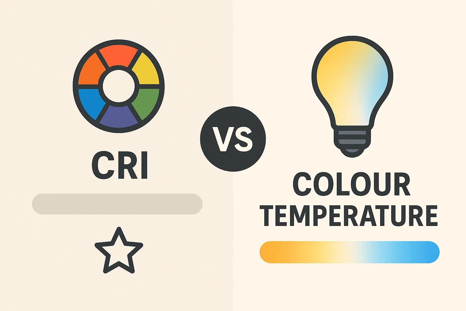
Two specifications appear on almost every LED package: colour temperature and CRI. Both affect how light looks and feels, but they measure entirely different things. Confusing one for the other leads to lighting that feels wrong even when the brightness is correct.
Colour temperature describes the tone of white light — whether it appears warm and golden or cool and blue. CRI describes how accurately that light renders colours compared to natural daylight. A bulb can have a perfect colour temperature for your room yet still make everything look flat and lifeless if the CRI is poor.
Understanding both measurements, and how they interact, is essential for choosing lighting that looks natural and performs well across different tasks.
Quick Comparison Table
| CRI (Colour Rendering Index) | Colour Temperature (Kelvin) | |
|---|---|---|
| What it measures | How accurately colours appear | How warm or cool light looks |
| Unit | 0–100 scale | Kelvins (K) |
| Higher value means | More accurate colours | Cooler, bluer light |
| Lower value means | Duller, distorted colours | Warmer, amber light |
| Affects | Colour accuracy of objects | Mood and atmosphere |
| Ideal range for homes | 80+ (90+ for kitchens/bathrooms) | 2700K–4000K |
Table of Contents
What Colour Temperature Actually Measures
Colour temperature is measured in Kelvins (K) and describes the visual warmth or coolness of white light. The scale is counterintuitive: lower numbers appear warmer, higher numbers appear cooler.
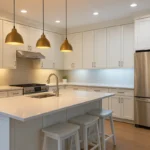
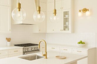
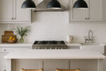
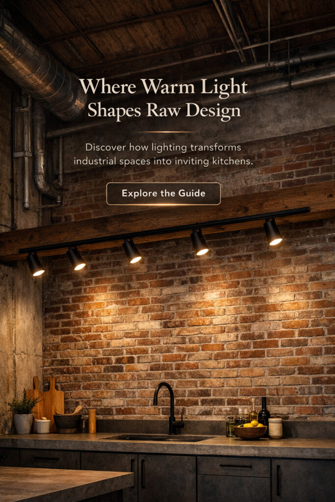
At 2700K, light has a soft amber tone similar to traditional incandescent bulbs. This creates a relaxed, intimate atmosphere suited to living rooms, bedrooms, and dining spaces. At 3000K, the light remains warm but slightly crisper — a popular choice for kitchens where warmth and functionality need to coexist.
Moving up to 4000K, light becomes noticeably neutral. There is no obvious yellow or blue cast, making it effective for task areas, offices, and utility spaces. Above 5000K, light takes on a cool, bluish-white quality that mimics midday daylight. This range suits garages, workshops, and commercial environments where maximum visibility matters more than atmosphere.
The key point is that colour temperature affects mood and ambience. It does not tell you anything about how accurately colours will appear under that light.

What CRI Actually Measures
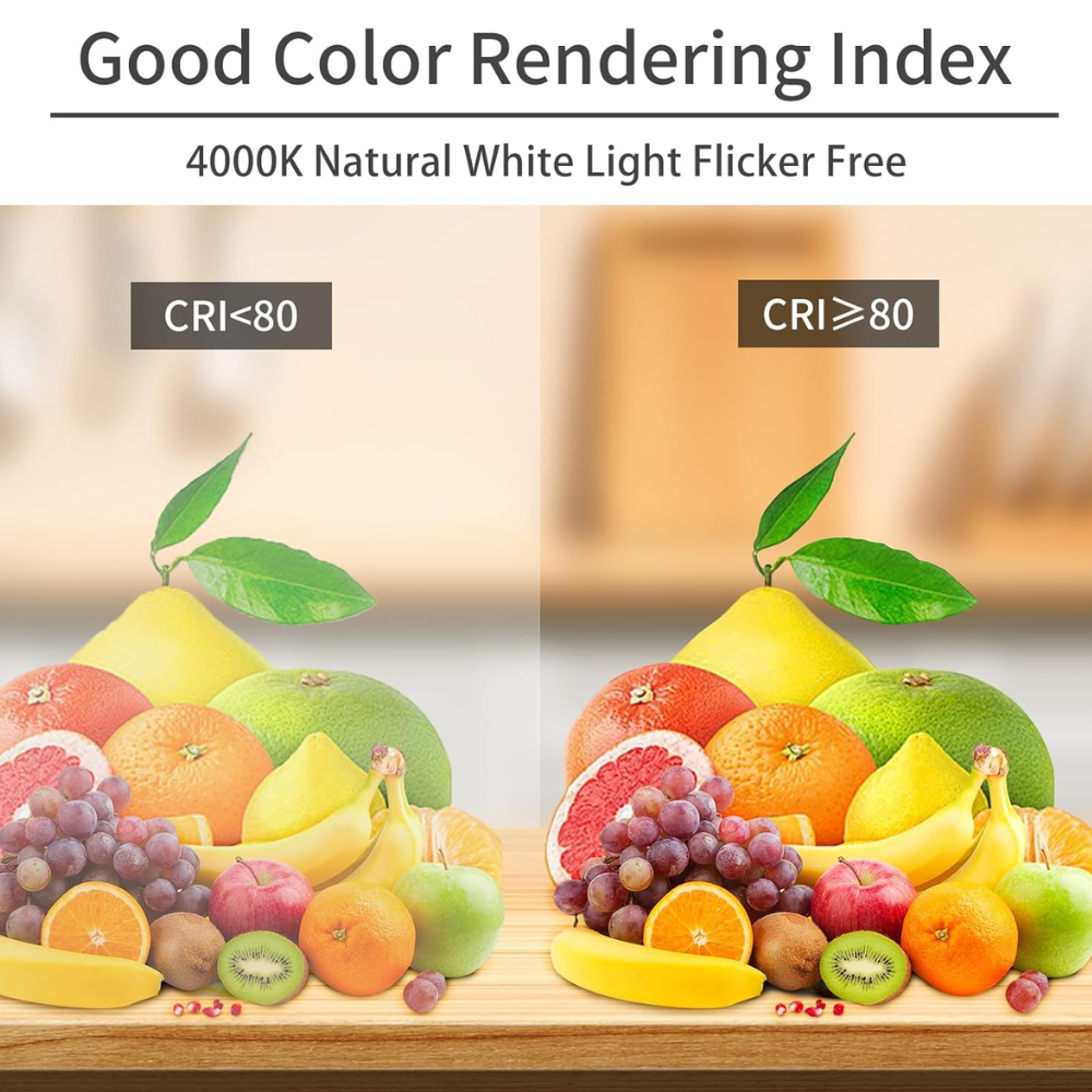
CRI stands for Colour Rendering Index. It measures how faithfully a light source reveals the true colours of objects compared to a reference light source — typically natural daylight or incandescent light, depending on the colour temperature being tested.
The scale runs from 0 to 100. A CRI of 100 means colours appear exactly as they would under the reference source. Lower scores mean colours are distorted, muted, or shifted in hue.
In practice:
- CRI below 70 produces noticeably dull or unnatural colours. Budget LEDs and older fluorescent tubes often fall into this range. Skin tones look grey, food looks unappetising, and fabrics lose their richness.
- CRI 80–89 is acceptable for most residential use. Colours appear reasonably accurate and most people will not notice significant distortion in everyday situations.
- CRI 90 and above delivers excellent colour accuracy. Reds, skin tones, and saturated colours appear vibrant and true. This range is important for kitchens, bathrooms, wardrobes, and anywhere colour judgement matters.
The limitation of CRI is that it averages performance across a set of test colours. A bulb can score 80 overall while still rendering certain colours poorly. For critical applications, some manufacturers now publish R9 values (deep red rendering) separately, since standard CRI testing underweights reds.
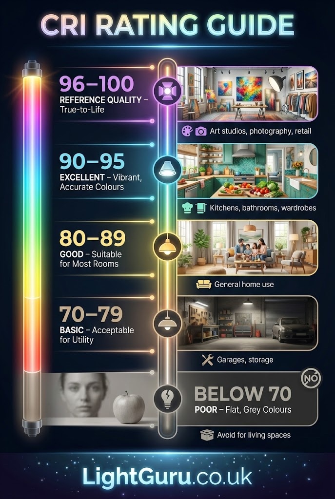
CRI Rating Guide
| CRI Rating | Colour Quality | Best For |
|---|---|---|
| Below 70 | Poor — colours look flat and grey | Avoid for living spaces |
| 70–79 | Basic — acceptable for utility areas | Garages, storage |
| 80–89 | Good — suitable for most rooms | General home use |
| 90–95 | Excellent — vibrant, accurate colours | Kitchens, bathrooms, wardrobes |
| 96–100 | Reference quality | Art studios, photography, retail |
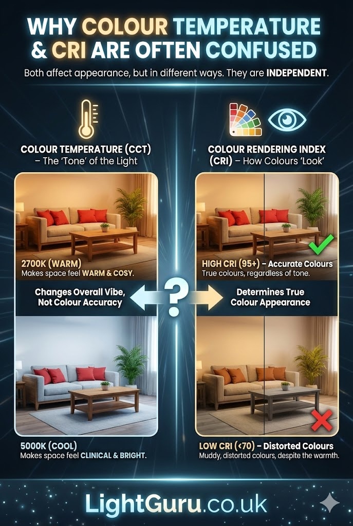
Why Colour Temperature and CRI Are Often Confused
The confusion arises because both specifications affect how light looks, but in different ways.
Colour temperature changes the overall tone of the room. A 2700K bulb makes a space feel warm and cosy. A 5000K bulb makes the same space feel clinical and bright. Neither tells you whether the red cushions on your sofa will look red or brownish-orange.
CRI determines whether colours look true regardless of the overall tone. A 2700K bulb with CRI 95 will show accurate colours within a warm palette. A 2700K bulb with CRI 70 will show muddy, distorted colours despite the same warmth.
You can have warm light with poor colour rendering. You can have cool light with excellent colour rendering. The two specifications are independent, which is precisely why both need to be considered together.
Use our Colour Temperature Selector to visualise different Kelvin values before you buy.
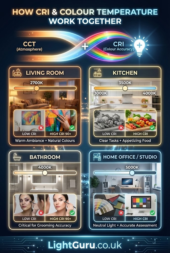
How CRI and Colour Temperature Work Together
The best lighting combines an appropriate colour temperature for the space with a CRI high enough to render colours accurately.
For a living room, a colour temperature around 2700K creates the right atmosphere. Pairing that with CRI 90+ ensures that artwork, furniture, and skin tones look natural rather than washed out.
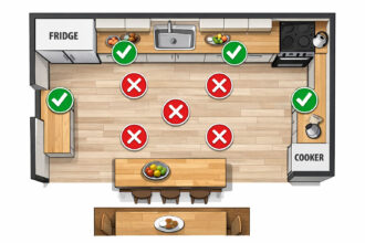
For a kitchen, 3000K to 4000K provides enough brightness and clarity for food preparation while remaining comfortable for dining and socialising. CRI becomes especially important here because food appearance matters — nobody wants vegetables that look grey or meat that looks brown when it should look red.
For a bathroom, particularly around mirrors used for grooming, colour accuracy is critical. A CRI below 80 can make makeup application unreliable and skin assessment difficult. Many designers recommend CRI 90+ for bathroom vanity lighting regardless of colour temperature choice.
For a home office or studio, neutral colour temperatures (4000K–5000K) combined with high CRI create an environment where materials, samples, and screens can be assessed accurately.
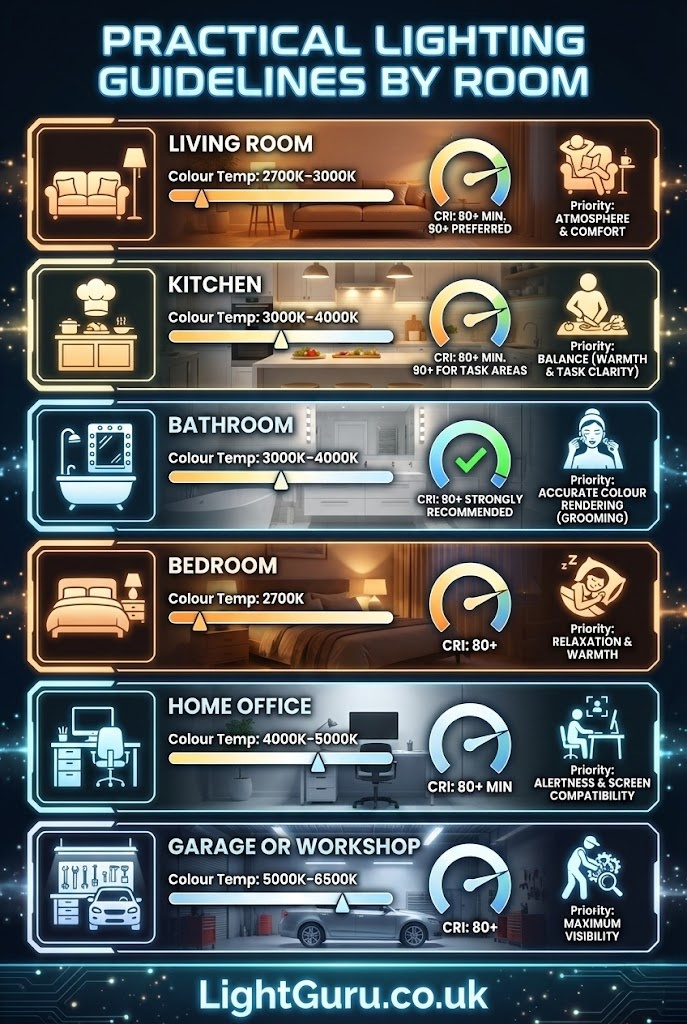
Practical Guidelines by Room
- Living Room Colour temperature: 2700K–3000K CRI: 80+ minimum, 90+ preferred Priority: Atmosphere and comfort
- Kitchen Colour temperature: 3000K–4000K CRI: 80+ minimum, 90+ for task areas Priority: Balance between warmth and task clarity
- Bathroom Colour temperature: 3000K–4000K CRI: 90+ strongly recommended Priority: Accurate colour rendering for grooming
- Bedroom Colour temperature: 2700K CRI: 80+ Priority: Relaxation and warmth
- Home Office Colour temperature: 4000K–5000K CRI: 80+ minimum Priority: Alertness and screen compatibility
- Garage or Workshop Colour temperature: 5000K–6500K CRI: 80+ Priority: Maximum visibility
Room-by-Room Guide
| Room | Colour Temperature | Minimum CRI | Priority |
|---|---|---|---|
| Living Room | 2700K–3000K | 80+ | Atmosphere |
| Kitchen | 3000K–4000K | 90+ | Task clarity + warmth |
| Bathroom | 3000K–4000K | 90+ | Colour accuracy |
| Bedroom | 2700K | 80+ | Relaxation |
| Home Office | 4000K–5000K | 80+ | Alertness |
| Garage/Workshop | 5000K–6500K | 80+ | Visibility |

Common Mistakes to Avoid
Assuming high colour temperature means high CRI A 6500K daylight bulb can still have a CRI of 70. The two are not linked. Always check both specifications.
Ignoring CRI for general home lighting CRI is often dismissed as relevant only for retail or photography. In reality, any space where you look at faces, food, clothing, or décor benefits from accurate colour rendering.
Mixing colour temperatures without intention Using 2700K pendants alongside 5000K downlights creates a disjointed, uncomfortable effect. If mixing temperatures, do so deliberately — for example, cooler task lighting under cabinets with warmer ambient lighting above.
Buying on lumens alone Brightness matters, but a 1000-lumen bulb with poor CRI and an inappropriate colour temperature will underperform a well-chosen 700-lumen alternative.

What to Look For When Buying
Check the packaging or product listing for both colour temperature (in Kelvins) and CRI. If CRI is not stated, treat the product with caution — reputable manufacturers publish this information.
For most home applications, aim for CRI 80 as a minimum and 90+ where colour accuracy matters. Colour temperature should be chosen based on the function and mood of the room, with consistency across fittings in the same space.
If you want flexibility, tuneable white LEDs allow colour temperature to be adjusted after installation. These are particularly useful in multi-purpose rooms or open-plan spaces where lighting needs change throughout the day.

FAQs
What CRI should I look for in kitchen lighting?
Aim for CRI 90 or above. Kitchens involve food preparation where colour accuracy matters — meat should look red, vegetables should look vibrant, and you need to spot when something is off. Lower CRI makes food look unappetising and can mask freshness.
Is CRI 80 good enough for home use?
For most rooms, yes. CRI 80 delivers acceptable colour accuracy for living rooms, bedrooms, and hallways. However, for kitchens, bathrooms, and anywhere you assess colours (wardrobes, home offices), CRI 90+ makes a noticeable difference.
Can I mix warm and cool lighting in the same room?
Yes, but do it intentionally. A common approach is cooler task lighting (4000K under-cabinet strips) paired with warmer ambient lighting (2700K–3000K pendants). Avoid random mixing — having a 2700K lamp next to a 5000K downlight looks disjointed.
Does colour temperature affect CRI?
No. They are independent measurements. A 2700K bulb can have CRI 70 or CRI 95. Always check both specifications rather than assuming one implies the other.
What is R9 and why does it matter?
R9 measures how accurately a light source renders deep red tones. Standard CRI testing underweights reds, so a bulb can score CRI 80 while still making reds look dull or brownish. For kitchens and bathrooms, look for products that specify R9 50+ alongside high CRI.
Does CRI matter for outdoor lighting?
Less so. Outdoor lighting typically prioritises visibility and security over colour accuracy. CRI 70–80 is usually sufficient for garden paths, driveways, and security lights. However, if you’re lighting an outdoor dining area or entertaining space, higher CRI improves how people and food appear.
Why don’t all LED bulbs list CRI?
Budget manufacturers often omit CRI because their products score poorly. If CRI isn’t stated, treat the product with caution. Reputable brands always publish this specification.
Final Thoughts
Colour temperature and CRI are two separate measurements that together determine how light looks and feels in a space. Colour temperature sets the mood — warm or cool, relaxed or energising. CRI determines whether the colours in that space appear true or distorted.
Neither specification alone guarantees good lighting. The best results come from understanding both and choosing products that match the specific requirements of each room.